Color is Better!
It’s simple, we love color! While green acts as a neutral color and a place for the eye to rest in most floral compositions, we can create these necessary moments of rest with negative space. In our designs we love to use colored foliages in place of green foliages because in our opinion it tends to look better and create a more ethereal aesthetic. “Greenery” or foliage is a necessary ingredient in a florists arsenal of tools. Foliage covers mechanics, is used en masse to create large scale installations, can fill holes in centerpieces without the cost of a focal bloom and introduces balance from the more denser petaled and larger blooms. But overuse, or unintentional placement can cause a very heavy feel that is both unattractive and lacks artistic qualities. So while foliage is necessary it doesn’t always have to be green.

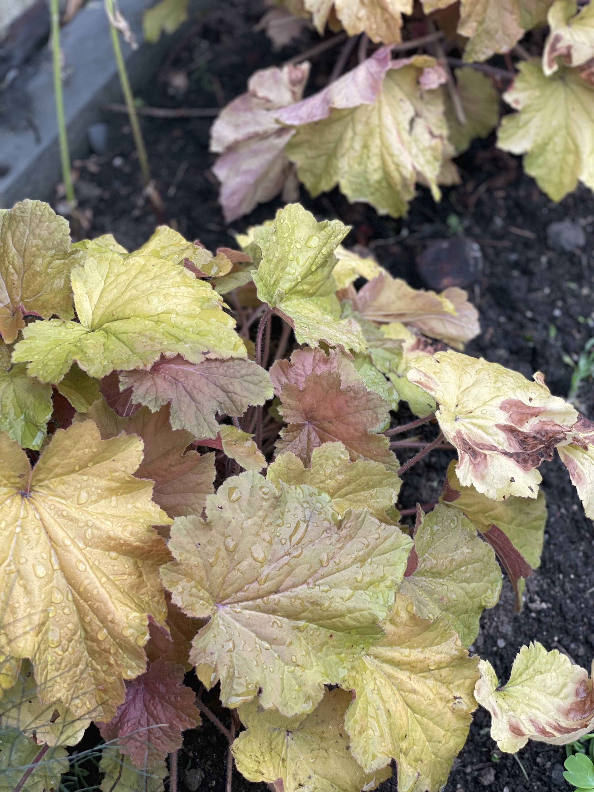
Don’t get us wrong we love greenery, when used appropriately. Everyone knows eucalyptus; it’s a staple in many floral designs but for the most part is pretty gray and muted. Over the years new cultivars have been found and bred but generally the green tones are the same. Using eucalyptus as the only foliage for floral designs doesn’t create depth or interest and so we shy away from using eucalyptus en masse. However, pairing standard or common greens like eucalyptus with more interesting greens, similar to the Japanese Painted Fern pictured above, can marry quite well and intensify your florals tremendously.
Just like you would find in nature, there are varying shades, textures, shapes and sizes of greenery.
You can find lime green fern growing on the underside of a fallen pine covered in chartreuse lichen. In the forest you will find shiny, deep green ivy climbing to meet its friend; the sharp, thin and sage colored pin needle. Pops of juniper green and forest green emerge from the blanketed desert floor of gray tones of sage brush and rabbit brush. Even in nature there is not just one type of green and so while we design we take this inspiration as a guideline to our floral compositions and always remember that Mother Nature knows best and introducing varying shades and colors of foliage mimics what we see every day.

Where we stand out and really enjoy working is in the colored side of foliages. Colored foliages not only pair better with those colored blooms but the overall composition feels more intentional and design forward. We strive to create design that cause your guests to stop and take a moment to “smell the roses” or just genuinely find joy from the flowers. No one is going to remember that eucalyptus garland in the center of your farm table; really I promise they wont! But what they will remember is that stunningly artful floral table display that had both focal points, resting points, and interesting foliages and flowers.
So while you are planning or thinking of your future wedding, begin to step away from the commonplace and overly used eucalyptus Pins and instead expand your familiarity with foliages and flowers that make you say “wow!, what is that?”.
